Ever noticed how certain colors make you look like you’ve traveled back in time—and not in a good way? The wrong color combinations can add years to your appearance faster than you can say ‘outdated wardrobe.’ I’ve spent years helping clients transform their look, and I’m here to share the color combos to avoid and what to wear instead for a more youthful vibe.
1. Beige on Beige: The Invisible Outfit
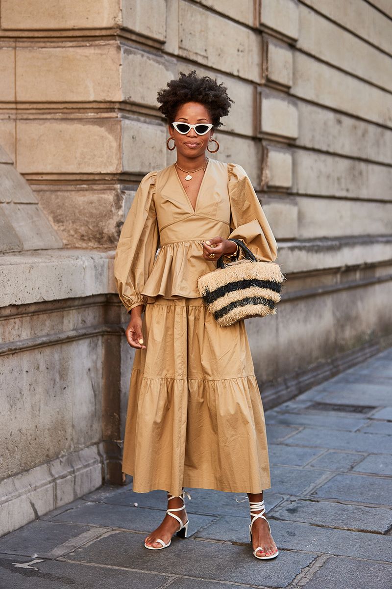
Wearing head-to-toe beige washes you out faster than a high tide! Instead, pair your favorite beige piece with vibrant colors like coral or turquoise.
Though neutrals have their place, all-beige ensembles scream ‘I’ve given up!’ Mix in some texture or a pop of color to breathe life into your look.
2. Navy and Black: The Funeral Director Special
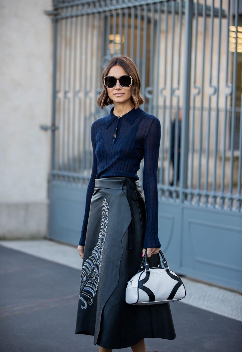
Whoever said navy and black don’t mix was onto something! This somber combo drains vitality from your face faster than a vampire at a blood bank.
Where once this pairing screamed ‘fashion faux pas,’ now it just screams ‘dated.’ Try navy with white or black with camel for a more contemporary, age-defying approach.
3. Pastels with Gray: The Grandma’s Couch Effect
Pairing baby pink or light blue with gray? Hello, 1985 called and wants its dusty color scheme back! This combination can make you look washed out and tired.
How about swapping that gray for a rich navy or chocolate brown instead? These deeper neutrals create contrast that defines your features rather than diminishing them.
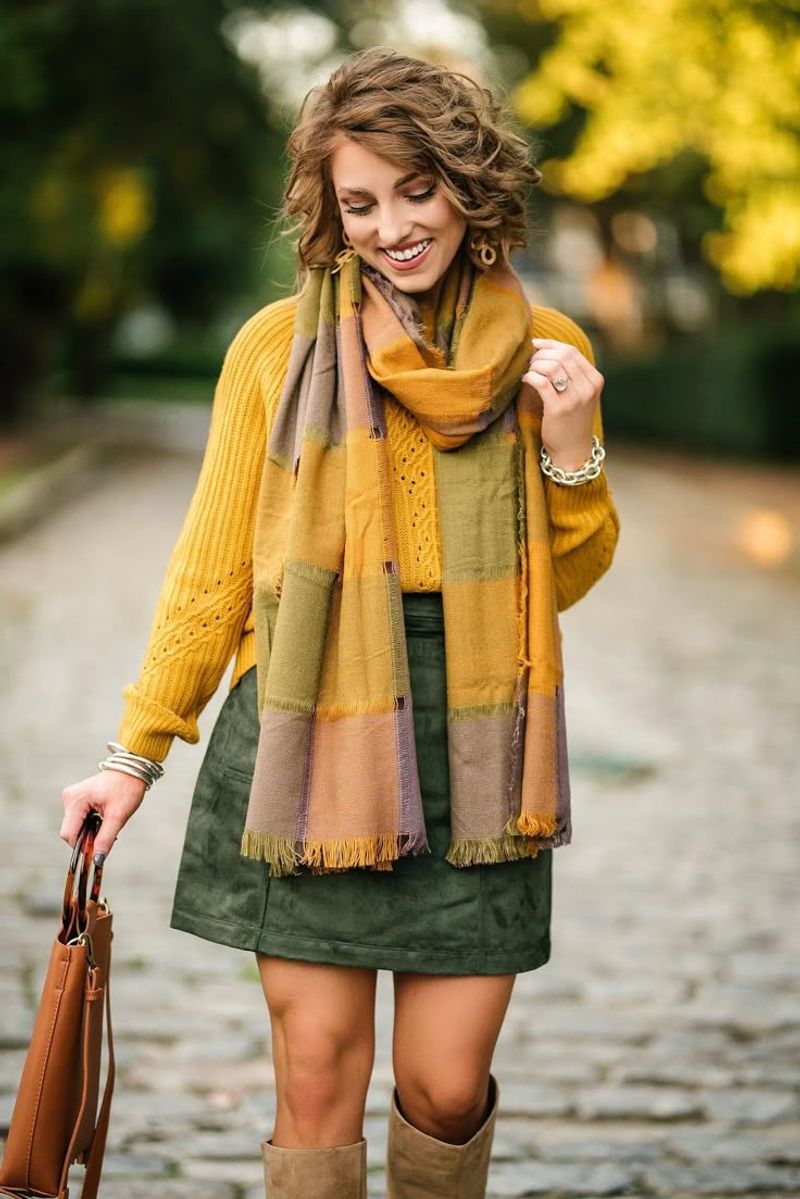
4. Burgundy and Forest Green: The Christmas Tree Trap
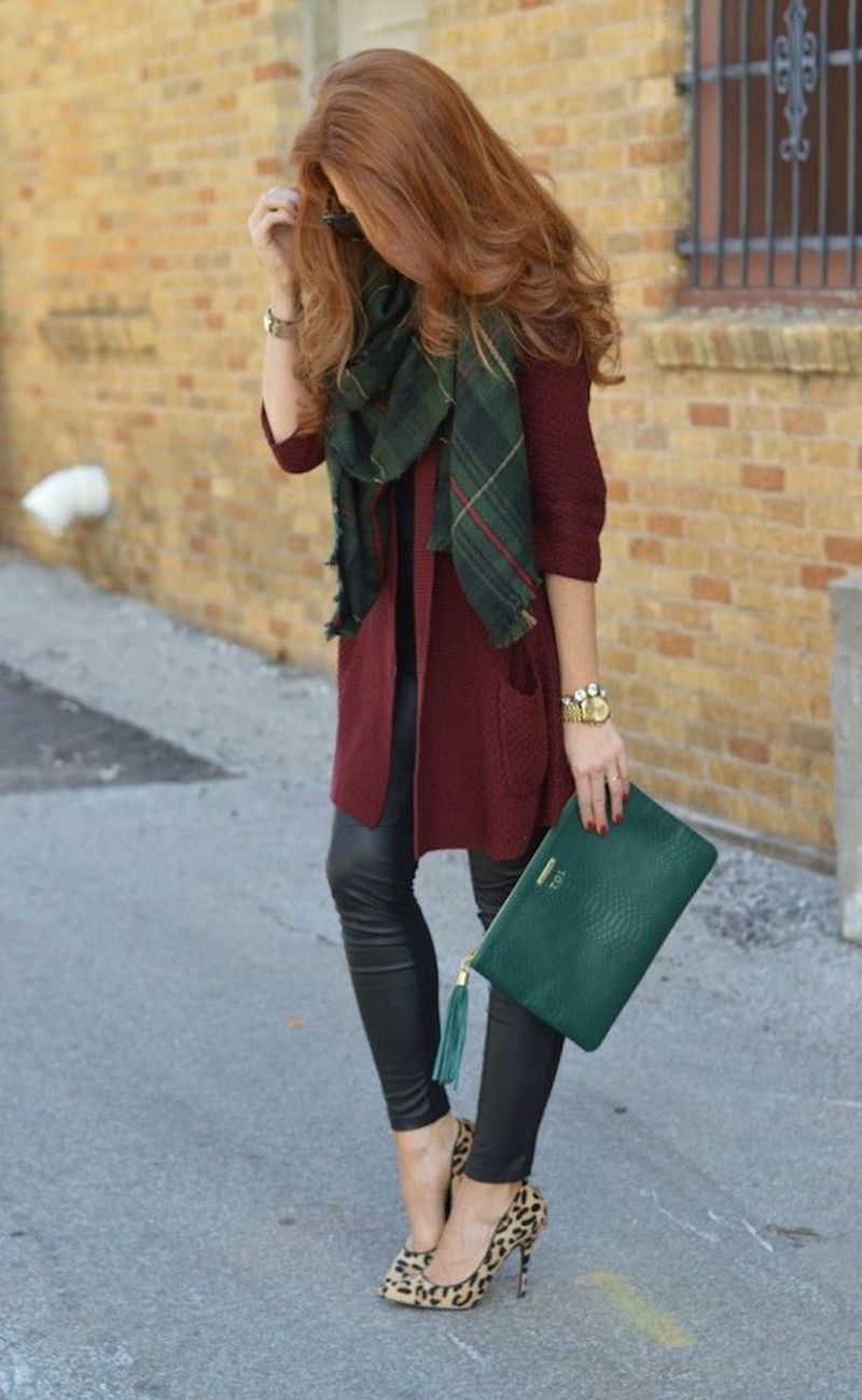
If you’re not actually decorating a tree, this holiday combo screams ‘I’m stuck in the 90s!’ Together, these dark tones create a heavy, aging effect that drags down your whole look.
Though individually gorgeous, when paired they’re about as fresh as last year’s fruitcake. Try burgundy with blush pink or forest green with mustard for modern, youthful alternatives.
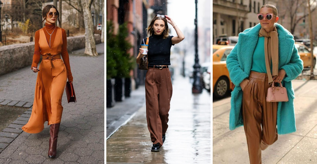
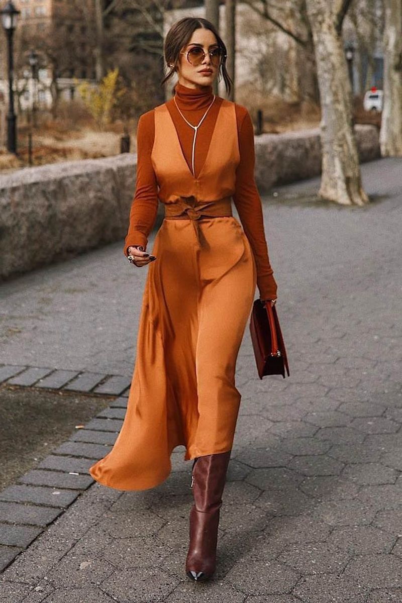
5. Brown with Orange: The Retro Rust Disaster
Ah, the 70s called—they miss their earth tones! Brown and orange together create a vintage vibe that’s less ‘retro cool’ and more ‘outdated school principal.’
If you’re craving warmth, try camel with cream instead, or pair that orange with navy for a surprisingly fresh combo. Your face will thank you for the instant brightness boost!
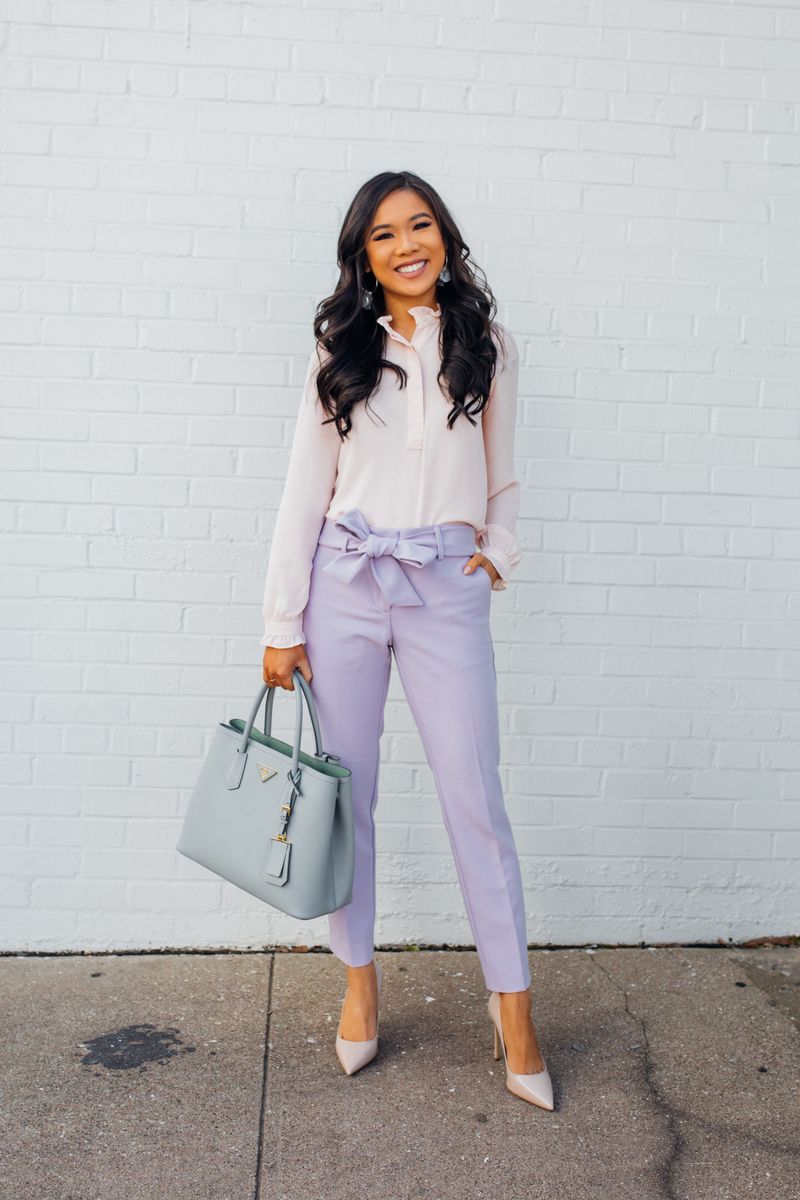
6. Purple and Yellow: The Bruised Banana Look
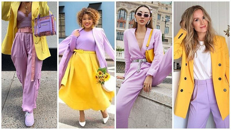
While complementary on the color wheel, this high-contrast pairing can be harsh on mature skin, highlighting every line like a magnifying mirror in direct sunlight.
Hence my advice: opt for softer versions like lavender with butter yellow. The gentler contrast creates harmony rather than highlighting your age markers—talk about a visual facelift!
7. Taupe with Mint Green: The Hospital Uniform
Nothing says ‘I’m here for my hip replacement’ quite like taupe and mint green together! This clinical combo drains color from your face faster than bad lighting.
If you adore mint, pair it with navy or charcoal instead. The contrast will bring life to your complexion rather than making you look like you’re waiting for medication.
8. Mustard Yellow and Olive Green: The Army Surplus Situation
Combining these two muddy tones creates a camouflage effect—and not in the trendy way! Your personality disappears faster than cookies at an office party.
Though individually these colors can shine, together they’re about as exciting as watching paint dry. Try mustard with denim blue or olive with cream for combinations that highlight rather than hide you.
9. Red and Purple: The Royal Headache
While royalty might approve, this bold combo creates such visual tension it can age you faster than stress and sunbathing combined! The clash fights for attention and overwhelms mature complexions.
Instead, try burgundy (a sophisticated red) with lavender (a subtle purple). This refined pairing offers the same color family without the aging, eye-straining effect.
10. Khaki with Tan: The Safari Gone Wrong
Unless you’re actually tracking lions, this beige-on-beige-on-beige situation is the fastest route to Blandville—population: you looking 10 years older! The lack of contrast flattens your features.
If safari vibes are your jam, pair khaki with turquoise or coral instead. The pop of color brings energy to your face and keeps you from looking like you’re about to narrate a nature documentary.
11. Brown and Black: The Funeral Director’s Apprentice
Contrary to what some fashion rules suggest, brown and black together aren’t modern—they’re muddy! This dreary duo drags down your complexion and screams ‘I dressed in the dark.’
Where fashion forward folks might claim this works, for most of us, it’s aging. Try chocolate brown with cream or black with camel instead for sophisticated contrast that brightens rather than dulls.
12. Pink and Green: The Watermelon Warning
While adorable on six-year-olds, this fruity combo can look childish on adults, creating a strange age disconnect that actually makes you look older trying to look younger!
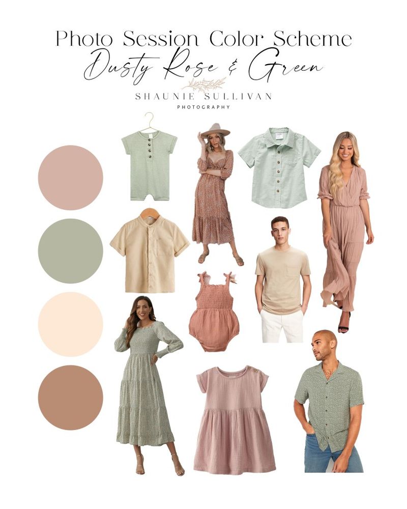
If you’re craving these colors, try a dusty rose with olive green instead. The sophisticated versions of these hues create a mature yet fresh palette that won’t make people wonder if you’re dressed for a kindergarten reunion.
13. Gray on Gray: The Human Thundercloud
Walking around in all gray is like carrying your own personal rain cloud! This monochromatic misery makes you look washed out, tired, and significantly older than your years.
Though gray has its merits, head-to-toe creates a dreary effect. Mix charcoal with bright white or soft gray with cobalt blue for combinations that illuminate rather than extinguish your natural glow.
14. Teal and Brown: The 80s Board Room Throwback
This combo screams ‘I still have shoulder pads in my closet!’ Teal and brown together create a dated corporate vibe that adds years faster than an all-nighter.
If teal makes your heart sing, pair it with navy or white instead. The fresher combinations bring this gorgeous color into the current decade without the aging, throwback effect of the brown partnership.
15. Mauve and Teal: The Golden Girls Special
Bless your heart if you’re still rocking this 80s Miami retirement home palette! Mauve and teal together create a time capsule effect that adds decades to your appearance.
Though these colors had their heyday, their reunion party is over. Try mauve with charcoal or teal with crisp white for combinations that honor these hues without the nostalgic aging effect.
16. Lavender and Mint: The Easter Egg Ensemble
Unless you’re literally the Easter Bunny, this pastel parade can wash out mature skin tones faster than cheap shampoo! The lack of contrast flattens features and highlights any sallowness.
If these soft hues call to you, try lavender with navy or mint with charcoal instead. The depth from darker partners creates definition that frames your face rather than fading it.
17. Brown and Orange: The 70s Living Room
Walking around in brown and orange is like wearing your grandmother’s sofa! This dated combo screams ‘my style peaked during the Nixon administration.’
How about trying rust orange with cream or chocolate brown with sky blue instead? These updated pairings give you the warm palette you crave without the time-travel effect that adds years to your appearance.