Tired of busy prints cramping your style? One-color outfits are taking the fashion world by storm, offering a sleek, sophisticated alternative that anyone can rock. I’ve spent years helping clients discover the power of monochromatic dressing – it’s slimming, elegant, and surprisingly easy to pull together from pieces you probably already own.
1. All-White Wonder
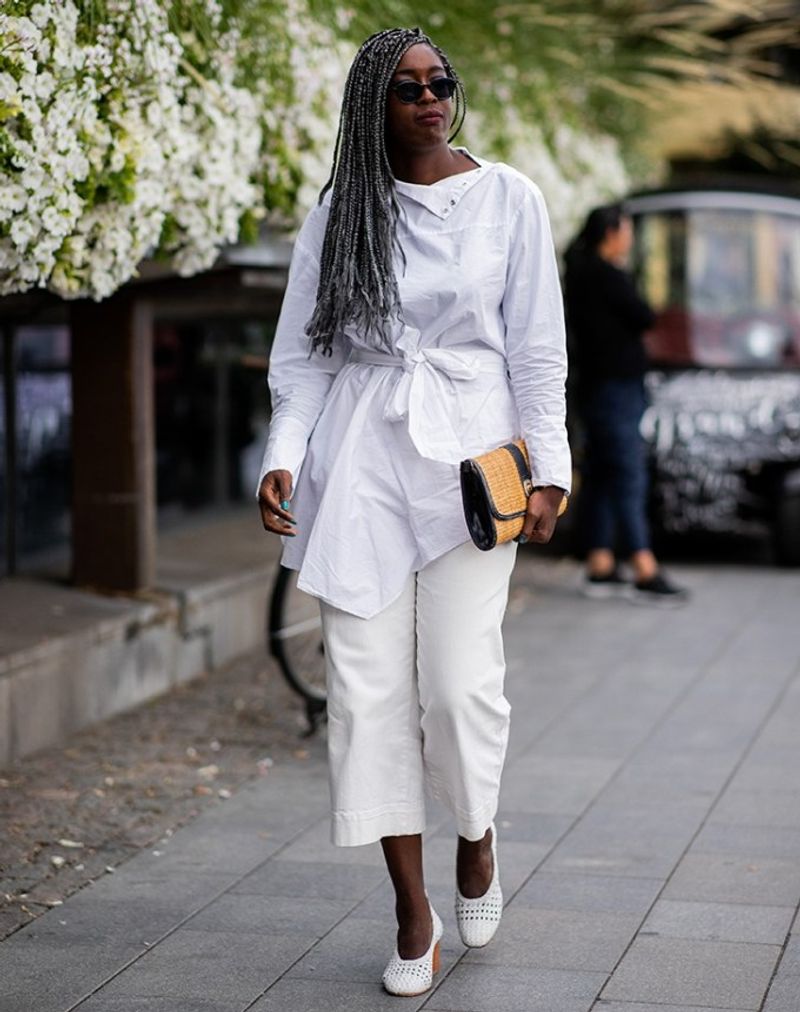
White-on-white creates an angelic vibe that’s perfect for summer brunches or beach weddings. Mix textures like crisp cotton shirts with flowy linen pants to add dimension.
Trust me, spilling coffee becomes your biggest fear, but the compliments make it worthwhile!
2. Midnight Magic
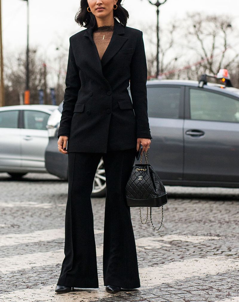
Though some fashion myths claim black is boring, I’ve witnessed countless jaws drop over a well-executed noir ensemble. Layer different black fabrics – silk, leather, cotton – to create visual interest without color.
Accessories in metallic finishes provide the perfect subtle accent.
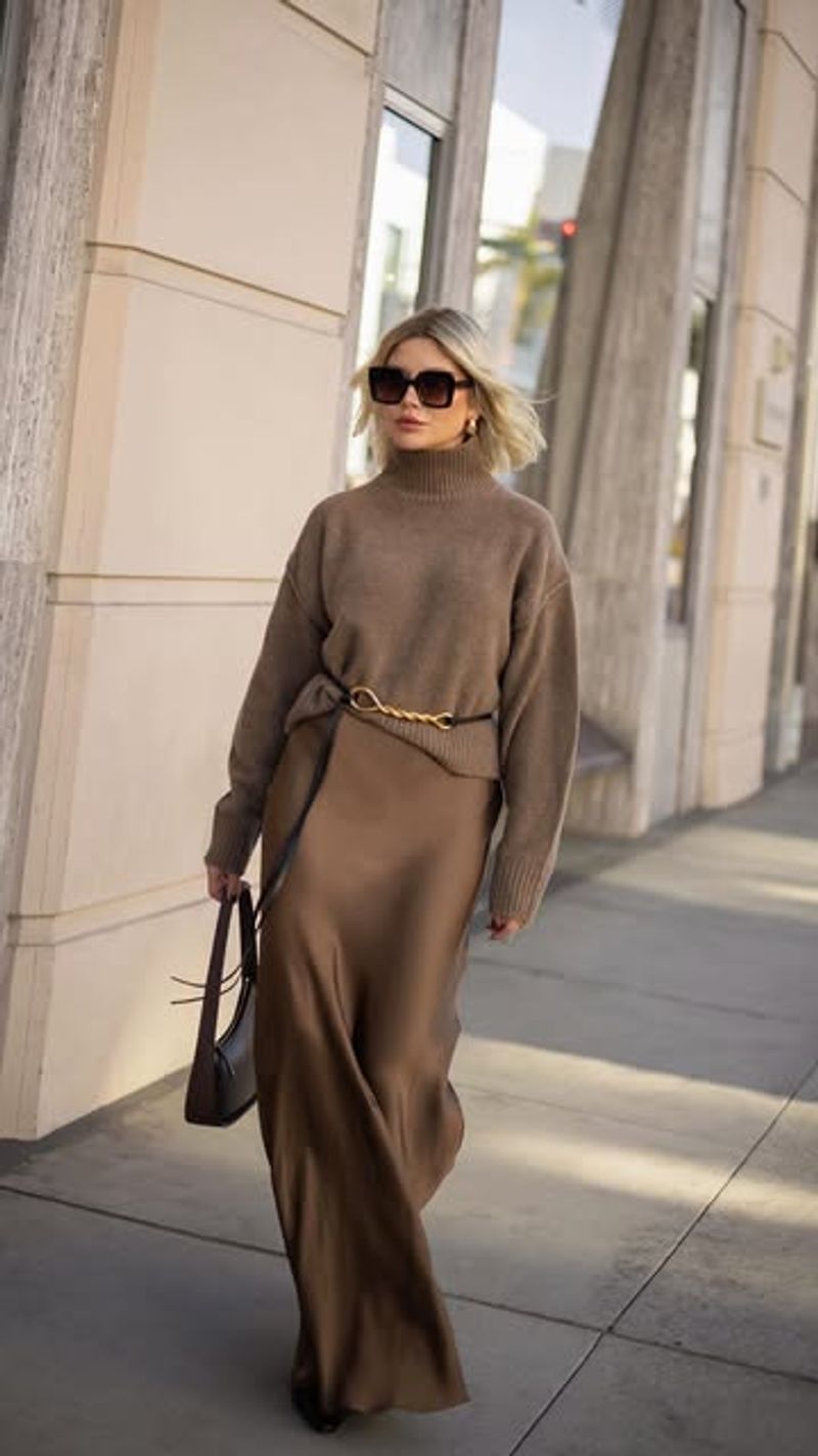
3. Camel Charisma
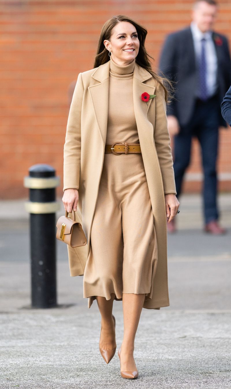
If you’ve never tried head-to-toe camel, you’re missing out on fashion’s most underrated power move. This warm neutral screams luxury even when the pieces are budget-friendly!
I recommend starting with a camel coat, then building your collection gradually with matching separates.
4. Red Hot
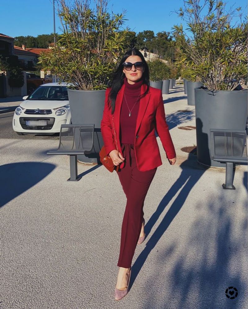
Whenever I’m feeling invisible, I reach for my all-red ensemble. Nothing commands attention quite like it! Varying shades from cherry to burgundy creates depth while maintaining the monochromatic vibe.
Surprisingly versatile, red works for both power meetings and dinner dates.
5. Navy Neutrality
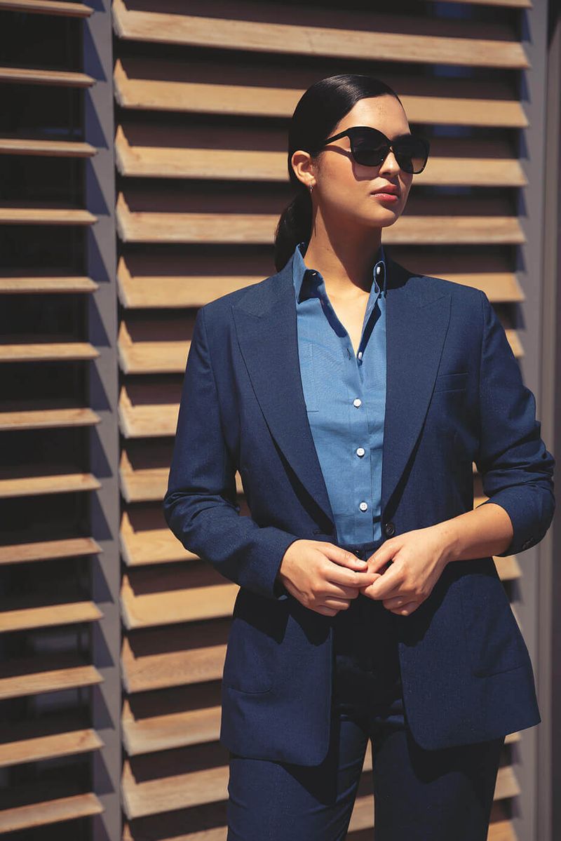
Navy deserves more credit as the softer alternative to black. I’ve converted countless clients who thought they couldn’t pull off monochrome until trying this sophisticated hue.
Hence my fashion rule: navy suits everyone, especially when paired with gold accessories for that nautical-chic effect.
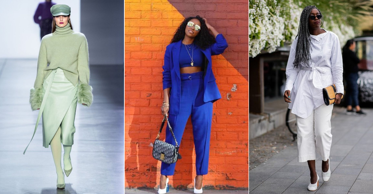
6. Pistachio Paradise
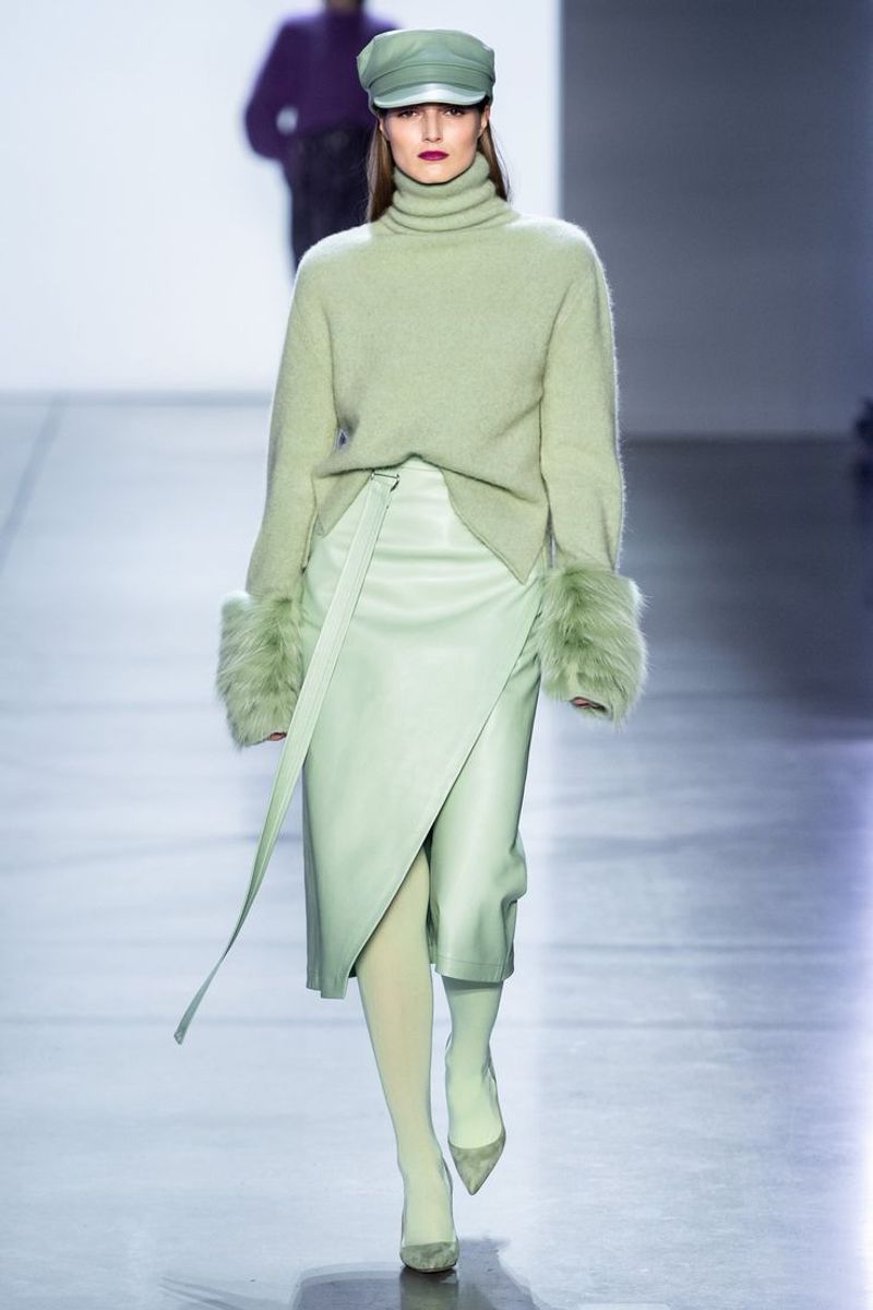
Where has pistachio green been all our lives? This unexpected color creates the most refreshing monochromatic look I’ve ever styled. Mixing mint and sage tones keeps it interesting without breaking the single-color rule.
Clients report feeling instantly happier when wearing this cheerful shade!
7. Lavender Love
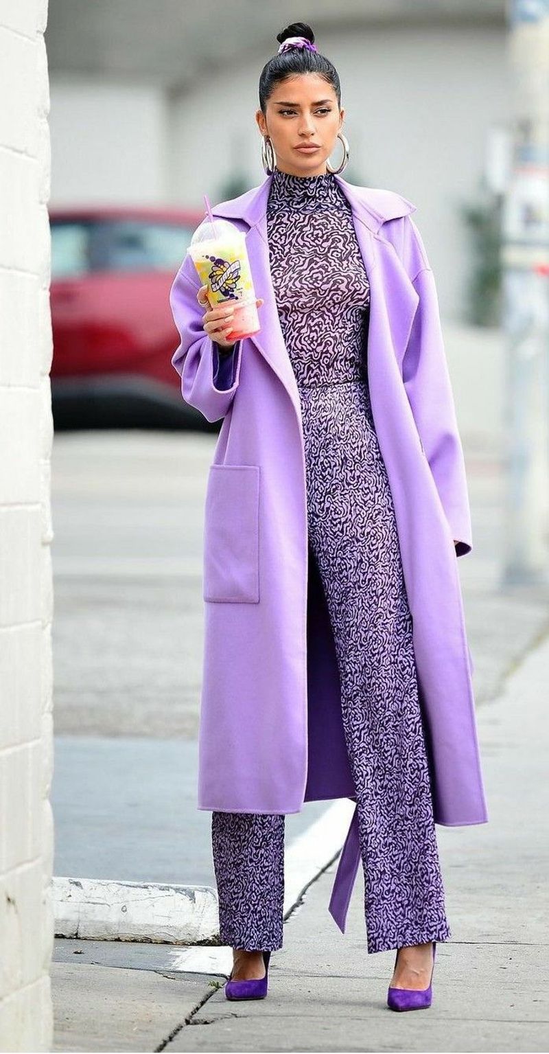
Contrary to popular belief, purple isn’t just for kids or eccentric aunts. Lavender worn head-to-toe creates an unexpectedly sophisticated vibe that turns heads for all the right reasons.
I suggest pairing matte and shimmery lavender pieces for a dimensional look that catches the light beautifully.
8. Gray Greatness
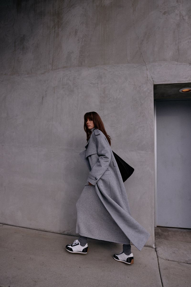
How often have I heard “gray is boring” only to silence critics with a perfectly executed charcoal-to-silver ensemble? Frequently! The secret lies in mixing at least three different gray tones.
Furthermore, adding textural elements like wool, cashmere, and silk elevates this look beyond basic.
9. Chocolate Decadence
Brown is having a major moment, and chocolate tones specifically offer warmth that black simply can’t match. I’ve witnessed entire rooms turn when a client walks in wearing varying shades of rich cocoa.
Leather accessories in matching brown create a cohesive look that’s both earthy and luxurious.
10. Blush Beauty
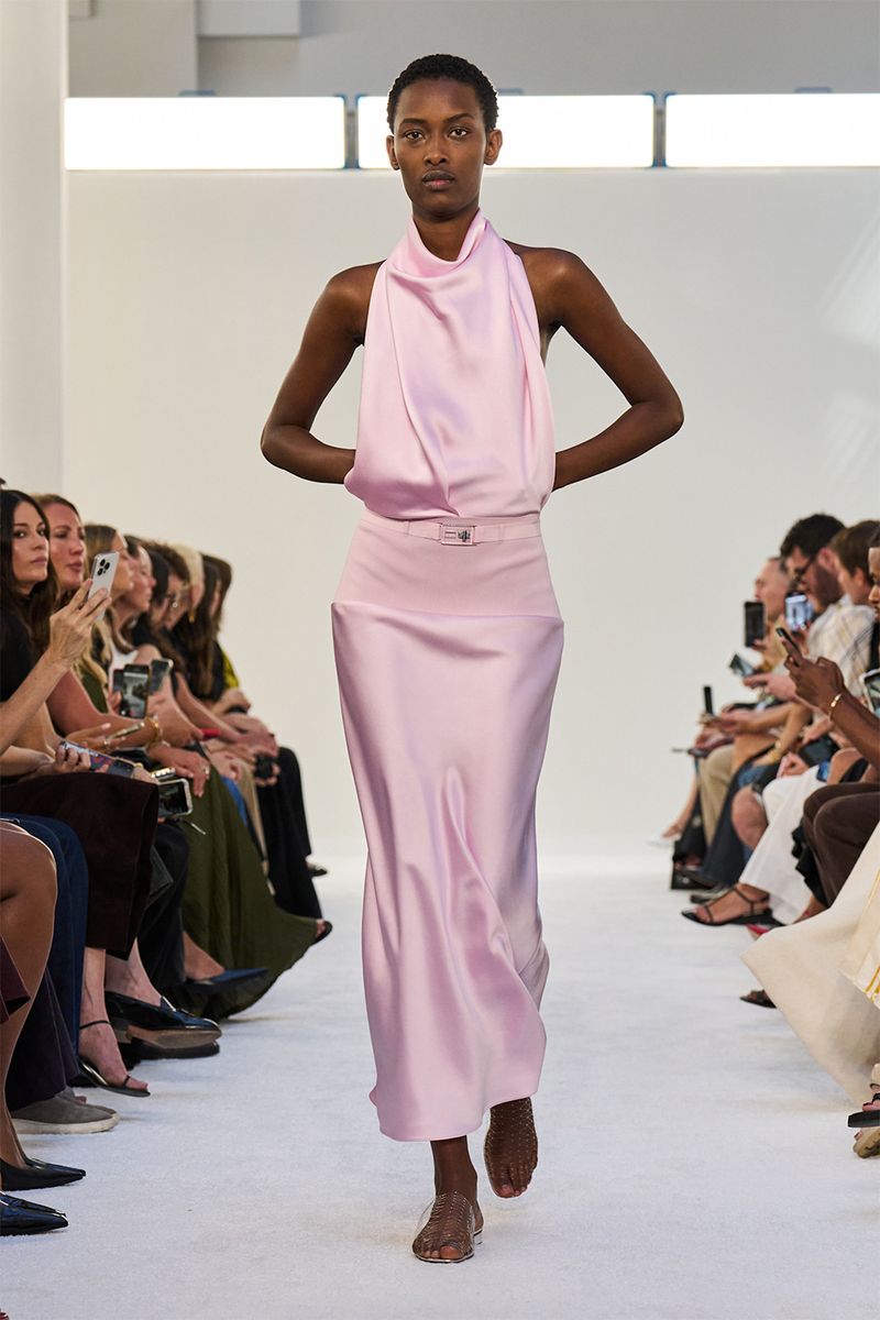
Surprisingly, blush pink worn head-to-toe doesn’t read as overly feminine – it’s actually quite modern! While styling a recent client, we discovered mixing matte and satin finishes creates the perfect balance.
Though often overlooked, this shade flatters all skin tones when you find your perfect pink undertone.
11. Emerald Elegance
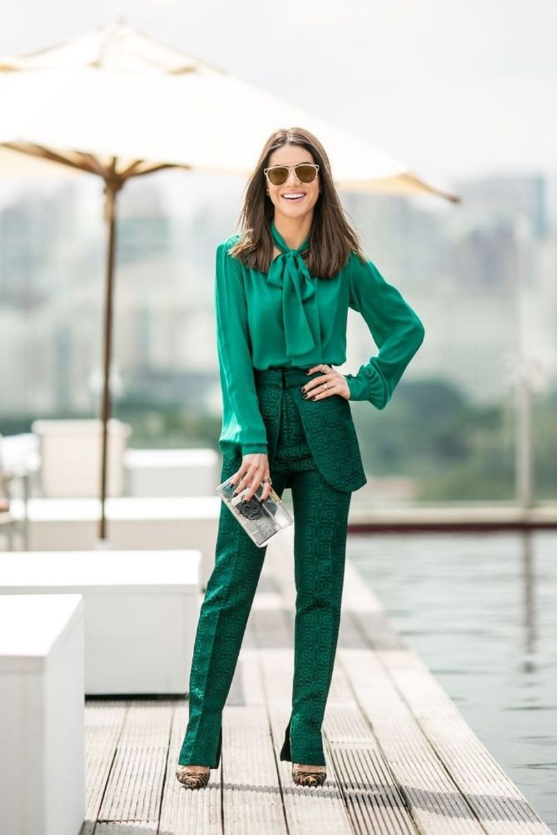
Green might seem intimidating as a monochromatic choice, yet emerald specifically creates the most regal look in my styling arsenal. The key? Keeping accessories minimal and letting the rich color do the talking.
I’ve found emerald particularly stunning for evening events where you want to stand out.
12. Sunny Yellow
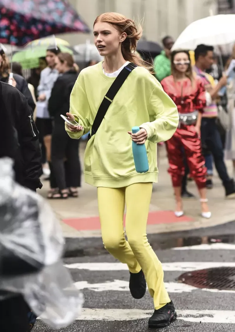
Yellow terrifies many fashion novices, but I’ve converted even the most color-shy clients with the right mustard-to-canary ensemble. The trick? Finding the yellow that complements your skin’s undertones.
However intimidating it seems initially, this color guarantees compliments and mood-boosting properties!
13. Tangerine Dream
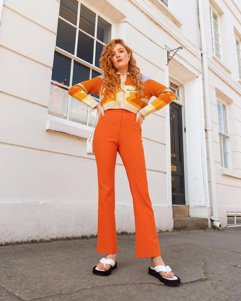
Orange worn from head to toe creates such an unexpected style statement that I’ve had strangers stop my clients on the street! Mixing bright tangerine with deeper burnt orange keeps it sophisticated rather than costume-like.
Few colors make a more confident statement for those bold enough to try it.
14. Cobalt Confidence
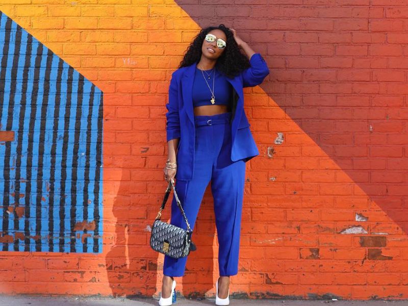
Cobalt blue packs such a visual punch that I recommend it to clients who need to command attention in professional settings. Unlike navy, it’s impossible to ignore without being as aggressive as red.
Though challenging to match exactly, slight variations in blue actually enhance the overall effect.
15. Cream Dream
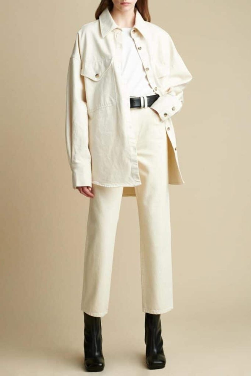
Cream differs from white in its warmth and forgiveness – both in terms of flattering different skin tones and hiding minor stains! I’ve created countless bridal looks using varying cream tones.
Whereas stark white can feel clinical, cream envelops you in cozy sophistication that works year-round.
16. Olive Obsession
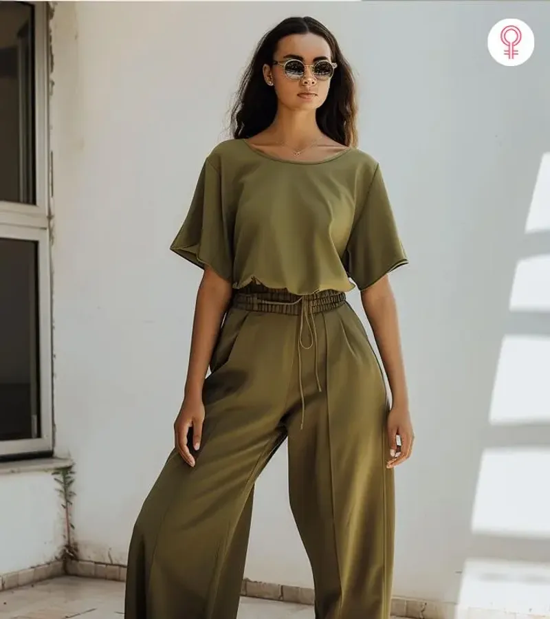
Military-inspired without being literal, olive green creates the most versatile monochromatic look in my styling portfolio. It functions essentially as a neutral while being more interesting than beige or gray.
Through years of experience, I’ve found it particularly flattering on those with warm skin undertones.
17. Burgundy Boldness
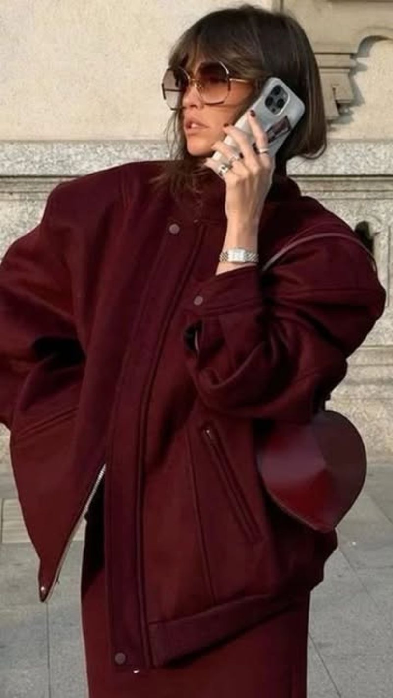
Whenever clients want sophistication with edge, I suggest burgundy-on-burgundy. This rich wine color bridges the gap between playful and professional, making it perfect for transitional seasons.
Though often relegated to autumn, I’ve created stunning year-round looks by varying the fabric weights.
18. Teal Temptation
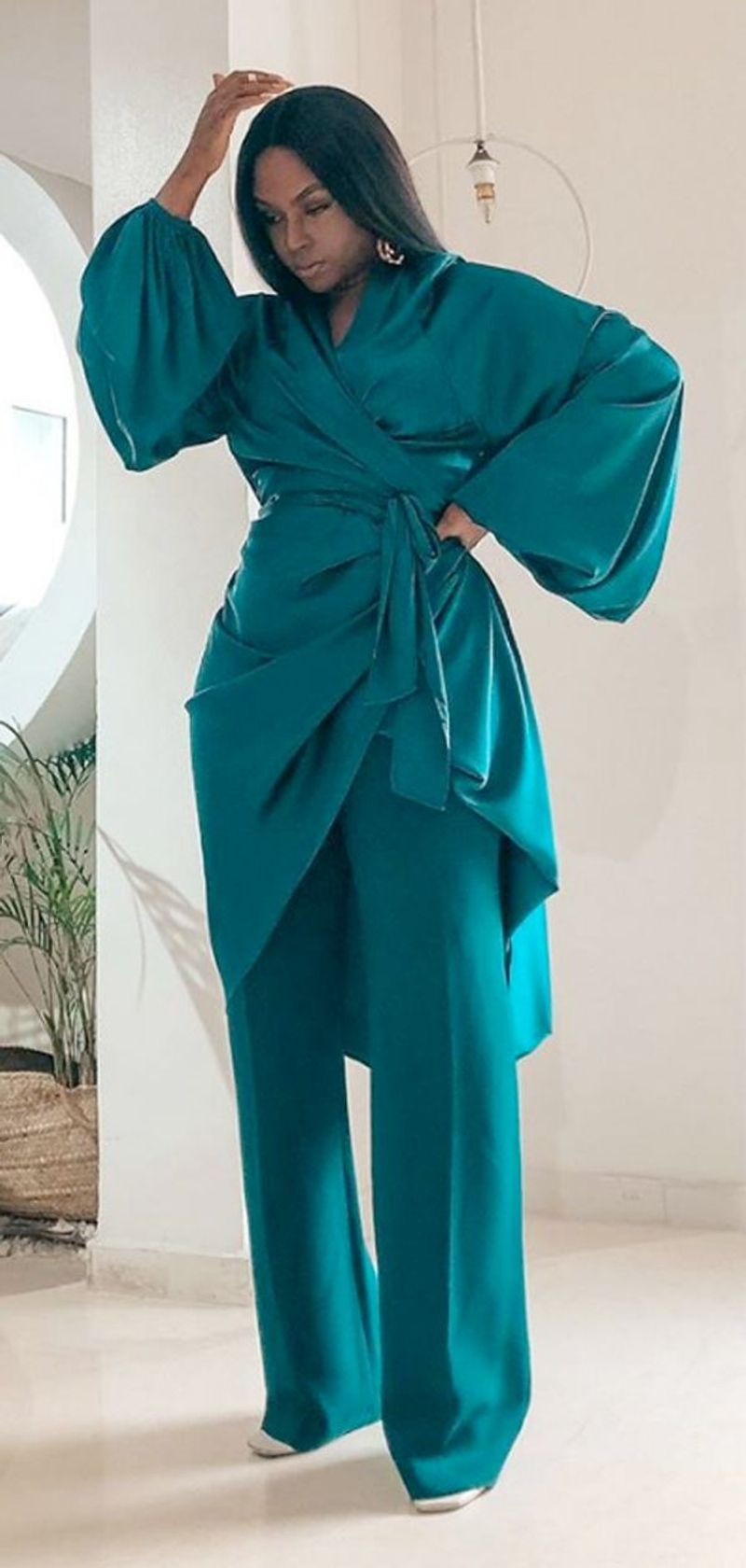
Teal sits perfectly between blue and green, offering the best qualities of both – the calmness of blue with green’s vitality. I’ve found it uniquely flattering on literally everyone I’ve styled.
While often overlooked, this jewel tone creates such a memorable impression that my clients report strangers asking about their outfit.
19. Powder Blue Perfection
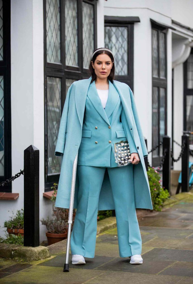
Forget baby showers – powder blue has grown up! This soft hue creates the most unexpected power look when worn from head to toe. I’ve converted numerous corporate clients to this alternative to navy.
Though seemingly delicate, it projects confidence while maintaining approachability, making it ideal for leadership positions.