Colors can transform your wardrobe faster than anything else! I’ve been spotting some seriously eye-catching hues taking over runways and street style lately. Forget those played-out pastels we’ve seen everywhere – I’m obsessed with these fresh, vibrant shades that are breathing new life into fashion this season.
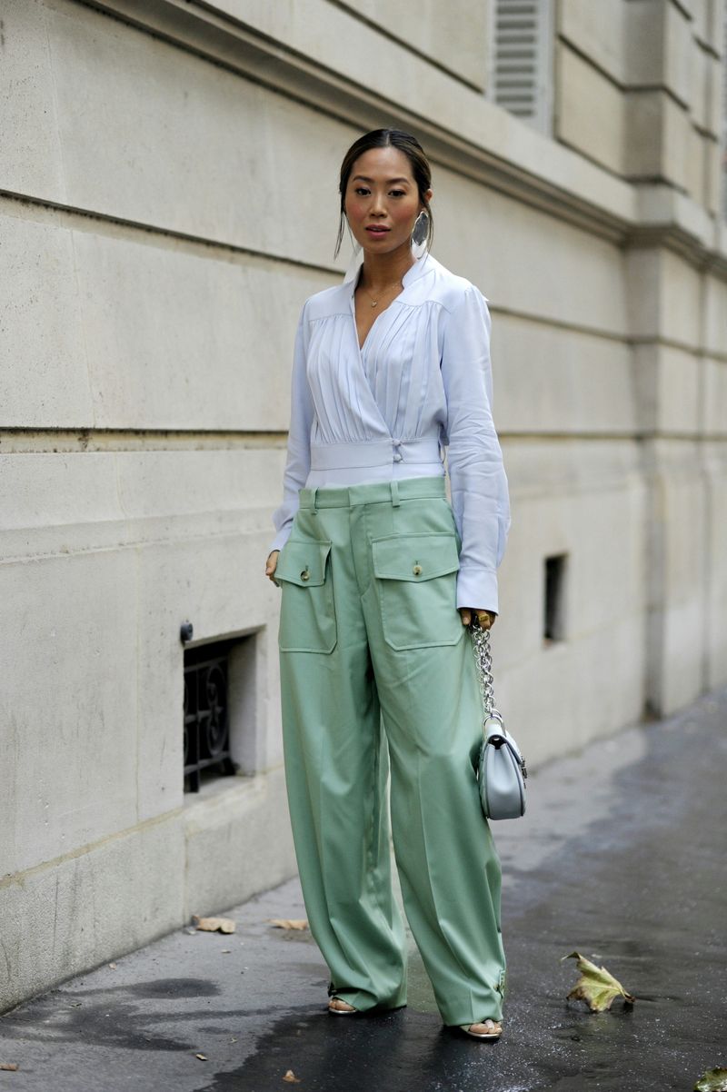
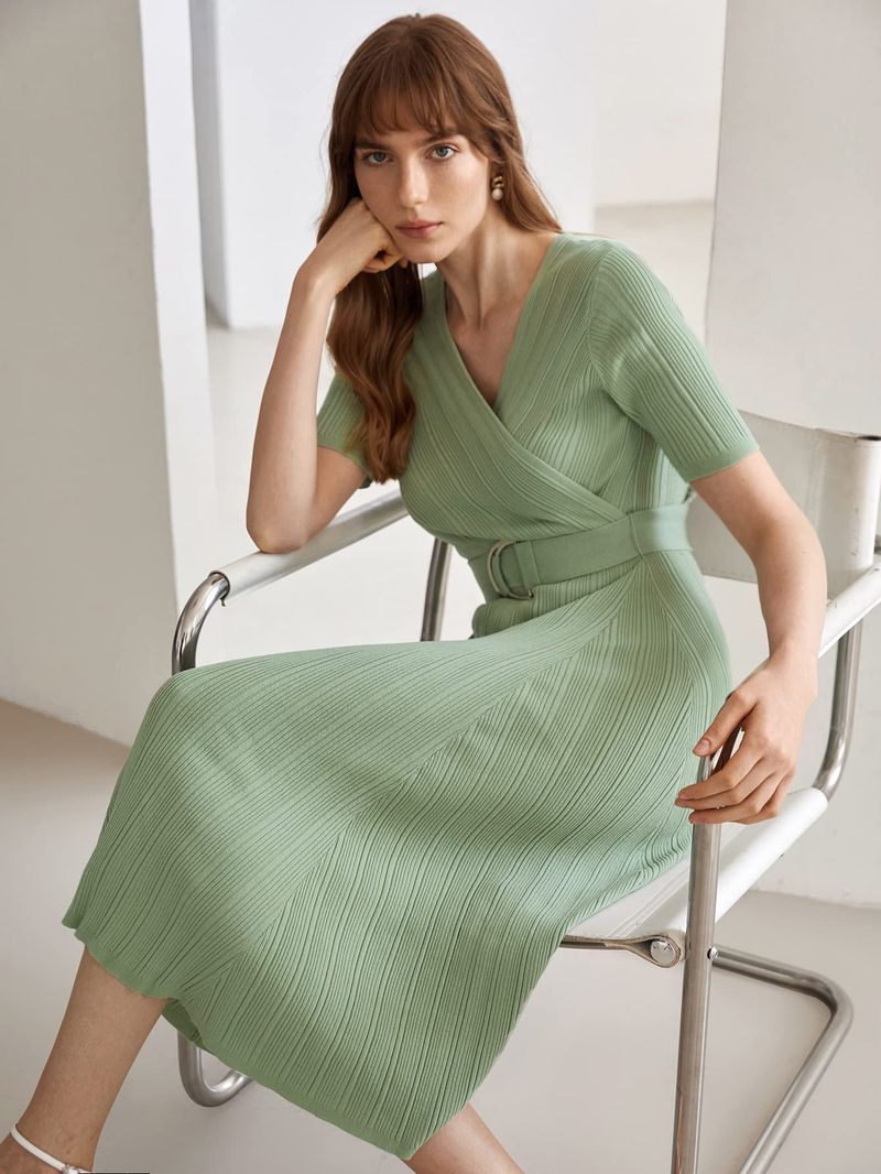
1. Matcha Green
Earthy yet vibrant, matcha green has stolen my heart! This verdant shade brings zen-like calm while still making a statement.
I’ve paired it with cream accents for a latte-inspired look that turns heads without screaming for attention. The subtle complexity makes it versatile for both statement pieces and accessories.
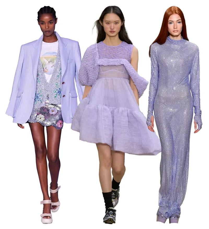
2. Digital Lavender
Move over millennial pink—digital lavender is having its moment! This tech-inspired purple feels both futuristic and soothing simultaneously.
Whenever I wear it, strangers actually stop me to ask about the color. Though subtle enough for office wear, it carries an unmistakable coolness factor that elevates even the simplest outfit.
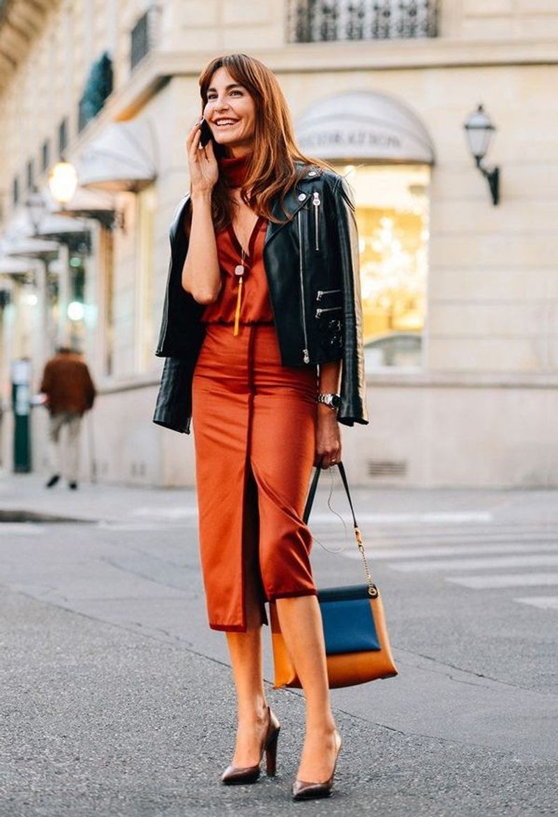
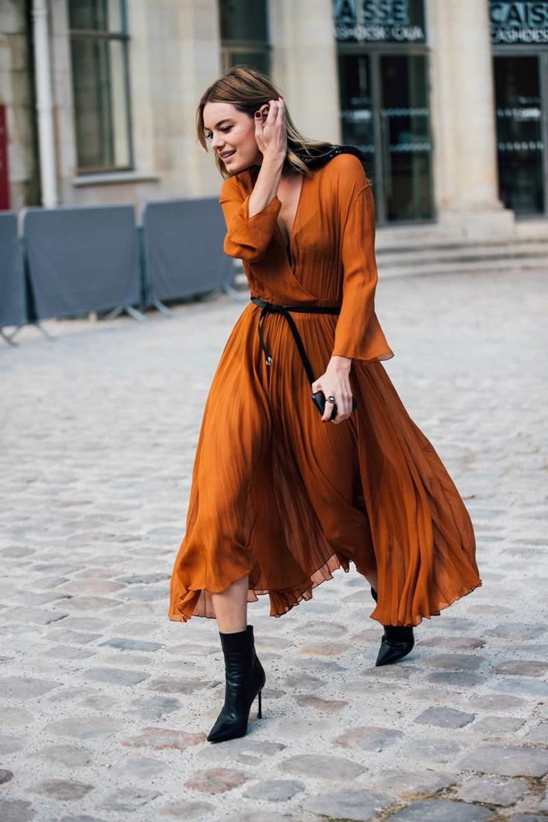
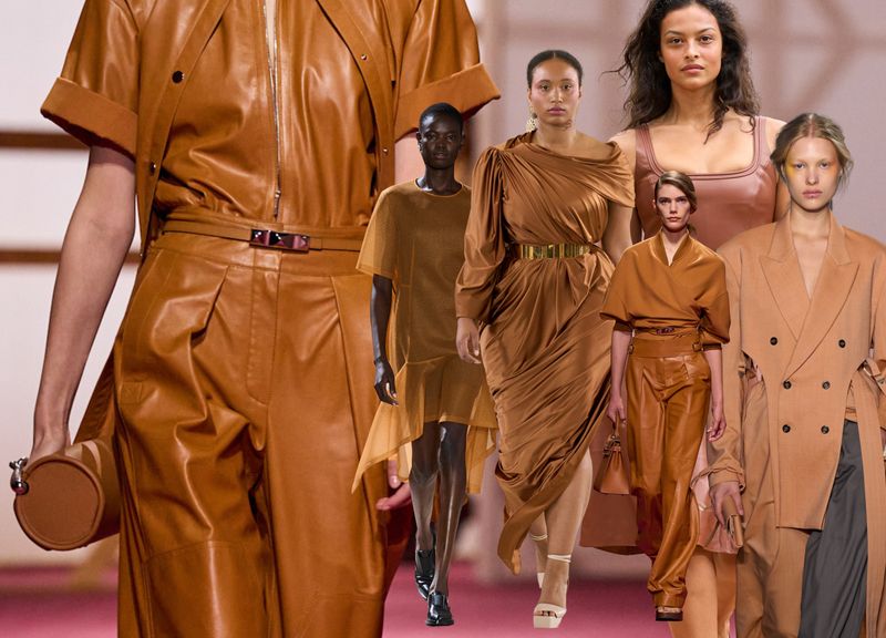
3. Terracotta Dream
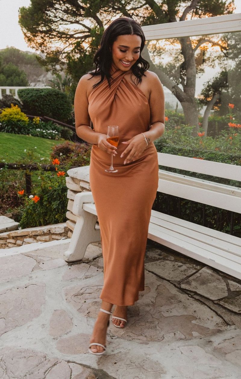
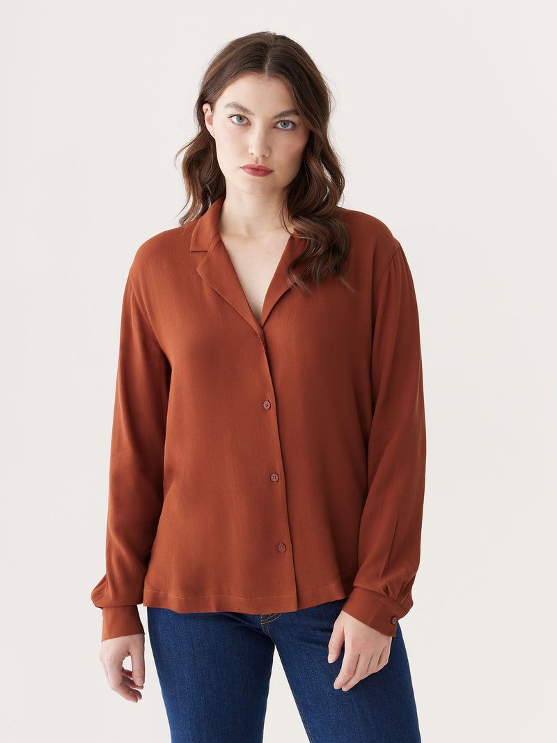
Honestly, terracotta makes everything look expensive! This rich, earthy tone has rescued me from countless wardrobe dilemmas.
Unlike those washed-out neutrals, terracotta carries warmth and depth that flatters virtually every skin tone. My favorite styling trick? Pairing it with turquoise jewelry for an unexpected desert-inspired combo.
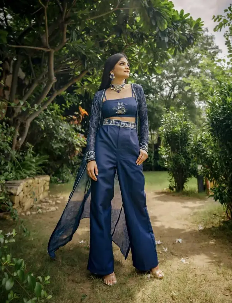
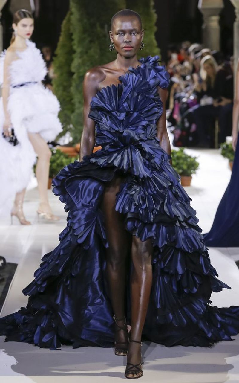
4. Celestial Blue
Somewhere between navy and royal lives celestial blue—my go-to when black feels too harsh. This dimensional shade captures the twilight sky just before darkness falls completely.
What makes it special? The subtle depth that shifts under different lighting. I’ve found it plays beautifully with both silver and gold accessories.
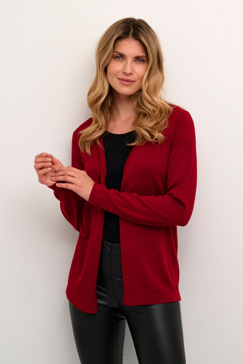
5. Sundried Tomato
Red’s sophisticated cousin has arrived! Sundried tomato delivers all the drama of crimson without shouting for attention.
The slightly muted quality makes it infinitely more wearable than traditional reds. When wearing this rich hue, I skip heavy makeup and let the color do the talking—it’s that powerful on its own.
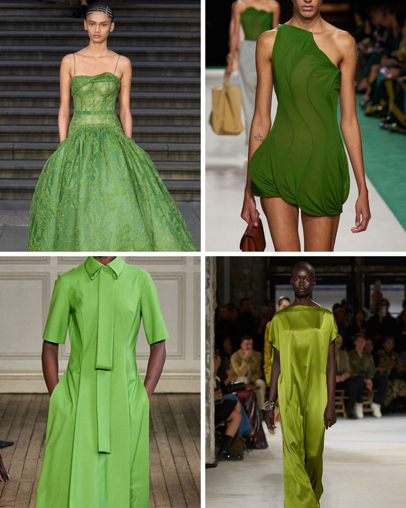
6. Pistachio Crush
Whoever claimed green wasn’t flattering never met pistachio crush! This creamy, yellow-tinged green brings unexpected freshness to winter wardrobes.
How versatile is it? I’ve worn my pistachio sweater with everything from denim to leather. The softness feels modern yet timeless—exactly what I look for in statement colors.
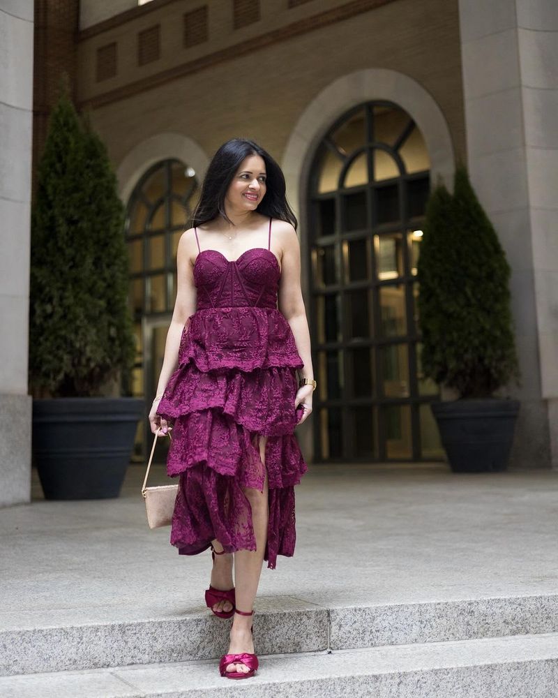
7. Ciruela de medianoche
Though dark like black, midnight plum delivers dramatic depth with actual personality. This mysterious shade reveals its purple undertones only in certain lighting.
Why it’s brilliant: the chameleon-like quality creates interest without overwhelming. My midnight plum coat receives more compliments than anything else in my closet.
8. Honeyed Amber
Forget traditional gold—honeyed amber brings warmth without the metallic flashiness. This golden-brown hybrid creates instant richness in any fabric.
Whenever my outfit feels flat, this molten shade adds dimension and luxury. The secret to styling? Pairing it with cream rather than stark white maintains the warm, cozy vibe.
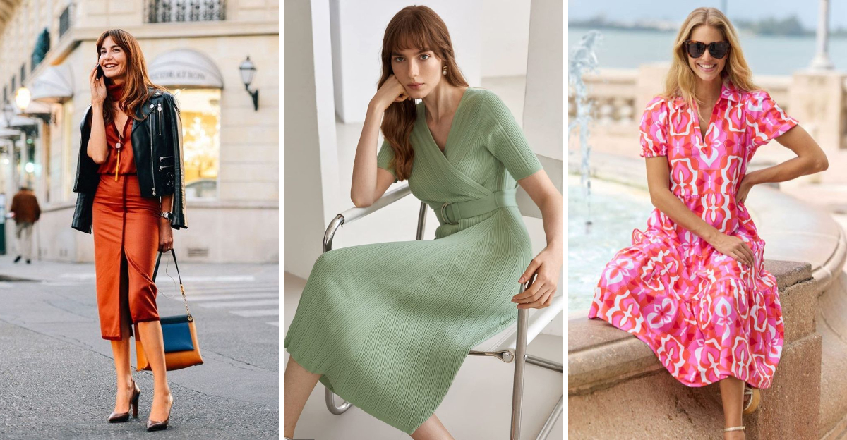
9. Minted Sage
Fresher than olive yet more sophisticated than mint, minted sage strikes the perfect balance. This cooling green has single-handedly converted me from a neutrals-only dresser!
How wonderfully it pairs with virtually everything in my closet. The subtle gray undertones make it remarkably wearable across seasons.
10. Blueberry Milk
Neither pastel nor navy, blueberry milk delivers softness with actual character. This cloudy blue-gray reminds me of hazy mountain mornings.
Why I’m obsessed: the milky quality softens the sometimes harsh nature of blue. Even my color-cautious friends have fallen for this approachable yet distinctive shade.
11. Toasted Coconut
White’s more interesting cousin has arrived! Toasted coconut delivers warmth that stark white simply can’t match.
The subtle golden undertones prevent that clinical feeling pure white sometimes creates. I’ve discovered it’s particularly magical during golden hour—when the light brings out all its creamy complexity.
12. Burnished Bronze
Halfway between brown and copper sits burnished bronze—the ultimate chameleon color. The metallic undertones catch light without veering into disco territory.
How surprisingly versatile! I wear it as a neutral with brighter colors or let it stand alone. The depth creates interest even in the simplest silhouettes.
13. Raspberry Sorbet
Neither pink nor red, raspberry sorbet delivers punch without looking childish. This grown-up berry tone manages to be both vibrant and sophisticated.
Whenever winter doldrums hit, I reach for this mood-lifting shade. The blue undertones make teeth look whiter and skin brighter—a happy accident I discovered after countless compliments!
14. Atlantic Teal
Deeper than turquoise yet brighter than navy, Atlantic teal captures oceanic depth perfectly. This jewel tone somehow manages to work year-round.
How versatile it proves when paired with unexpected colors! My favorite combination: Atlantic teal with burnt orange—an unexpectedly harmonious pairing that always generates compliments.
15. Smoked Paprika
Red’s sophisticated older sibling has arrived! Smoked paprika brings warmth without the harshness of traditional reds.
The brownish undertones create remarkable depth that photographs beautifully. I’ve found it particularly striking in textured fabrics like velvet or corduroy, where light plays across the surface.
16. Butter Toffee
Not quite caramel, not quite gold—butter toffee delivers rich warmth with unexpected versatility. This honeyed neutral somehow flatters every skin tone I’ve seen it on.
How wonderfully it pairs with almost anything! The golden undertones create a subtle glow effect that’s particularly stunning in natural fibers like silk and linen.
17. Midnight Navy
Black gets dethroned! Midnight navy delivers all the slimming properties of black without the harshness. This inky blue-black creates stunning depth in photographs.
How surprisingly versatile it proves for evening wear! The subtle blue undertones catch light in ways pure black simply cannot, creating dimension that feels luxurious.
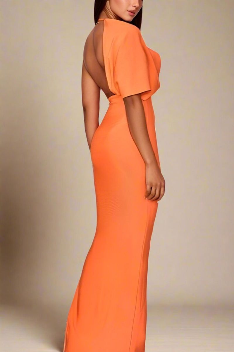
18. Burnished Apricot
Orange grows sophisticated! Burnished apricot delivers warmth without veering into pumpkin territory. The subtle dustiness makes it remarkably wearable even for orange-phobes.
Whenever I need a confidence boost, this vitamin-C-inspired shade delivers instant energy. The golden undertones create a subtle glow effect that’s particularly flattering.
