As we age, our color choices can dramatically impact how we’re perceived. The right colors can enhance natural beauty and project confidence, while others might make us appear dated or trying too hard. Finding your perfect palette isn’t about following rigid rules—it’s about understanding which hues complement your evolving style and maturity.
1. Neon Pink: The Youth-Grabbing Mistake
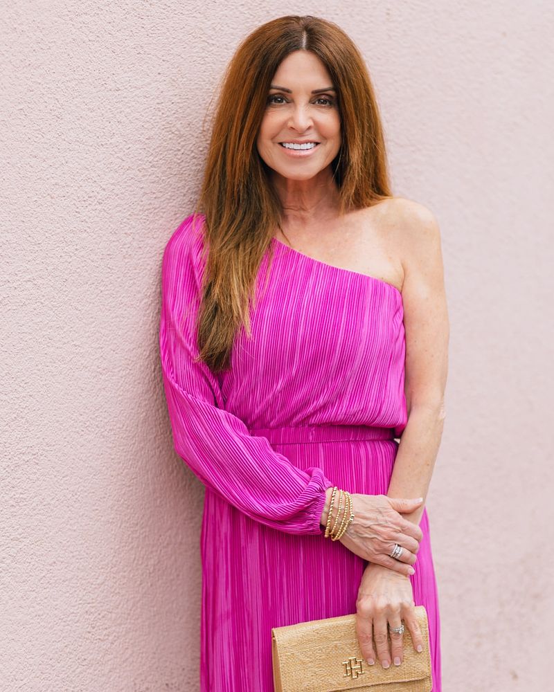
Shocking pink screams ‘desperately clinging to youth’ rather than embracing elegant maturity. This eye-searing shade often creates a jarring contrast against mature skin tones.
Instead of appearing vibrant, you might just look like you raided your teenage granddaughter’s closet. Save this hue for small accessories if you absolutely must incorporate it.
2. Hot Orange: Too Loud For Comfort
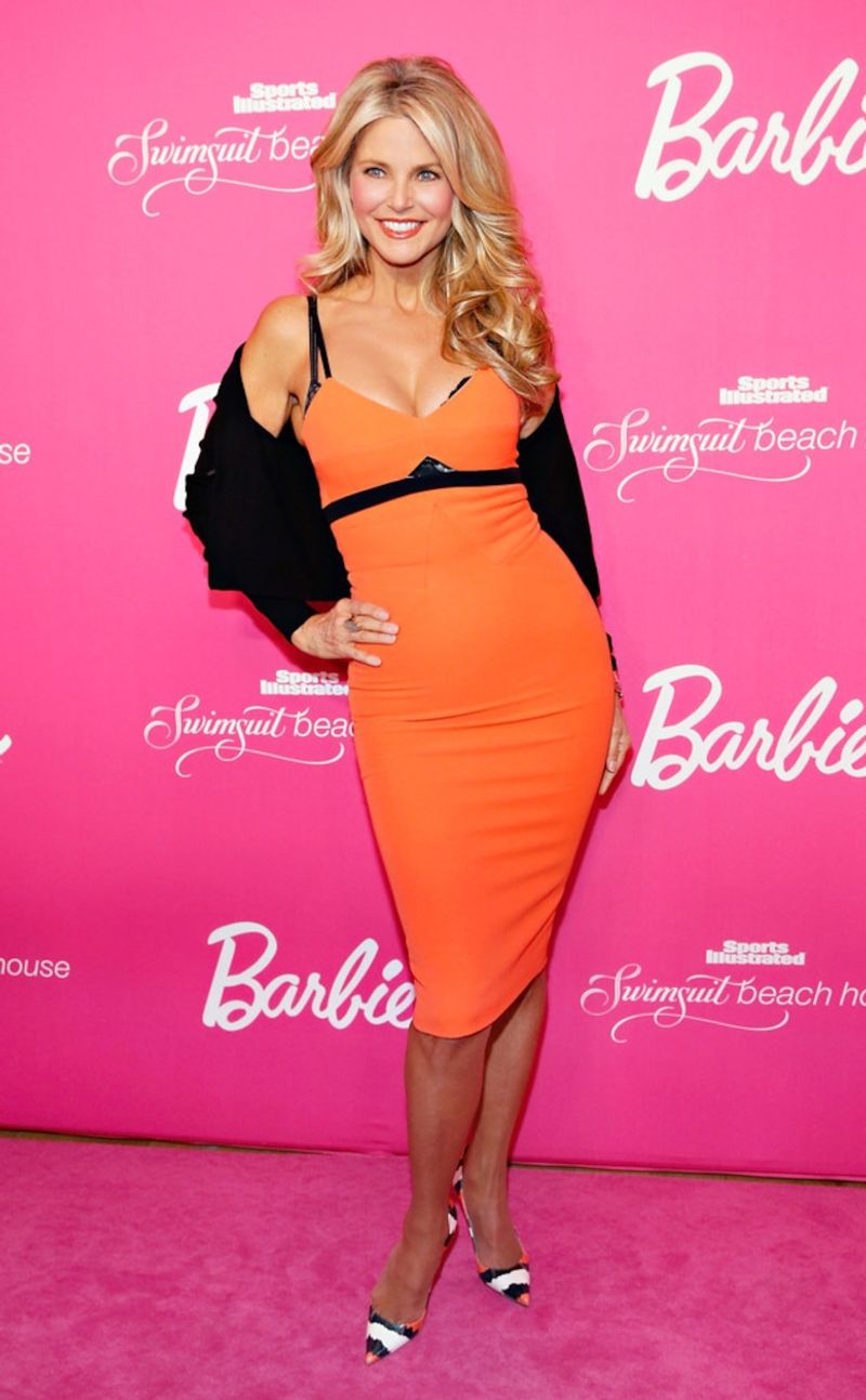
Fiery orange tones can overwhelm mature complexions, drawing attention to redness or uneven skin tone. This traffic-cone brightness often appears garish rather than sophisticated.
Many mature women find that this color makes them feel self-conscious rather than confident. The intensity competes with, rather than complements, the natural beauty of aging.
3. Juvenile Purple: The Barney Effect
Bright, primary purple evokes children’s cartoon characters and teenage bedroom walls. This particular shade can make mature women appear as though they’re trying to recapture youth in all the wrong ways.
The artificial brightness creates a costume-like effect rather than a stylish statement. Mature beauty deserves more nuanced color choices that honor wisdom and experience.
4. Acid Green: The Attention-Grabber Nobody Asked For
Lime green might work for athletic wear, but as a fashion statement for mature women? Hard pass. This eye-straining shade draws attention for all the wrong reasons.
Rather than highlighting your best features, acid green tends to cast unflattering shadows and emphasize skin discoloration. The artificial brightness feels incongruous with the natural grace that comes with maturity.
5. Bubble Gum Blue: The Childish Throwback
This candy-colored blue belongs in a nursery, not a mature woman’s wardrobe. The saccharine quality reads as juvenile and unsophisticated.
Bubble gum blue creates a disconnect between your appearance and the wisdom you’ve earned. The artificial brightness lacks the depth and complexity that complement a woman who has lived a full life.
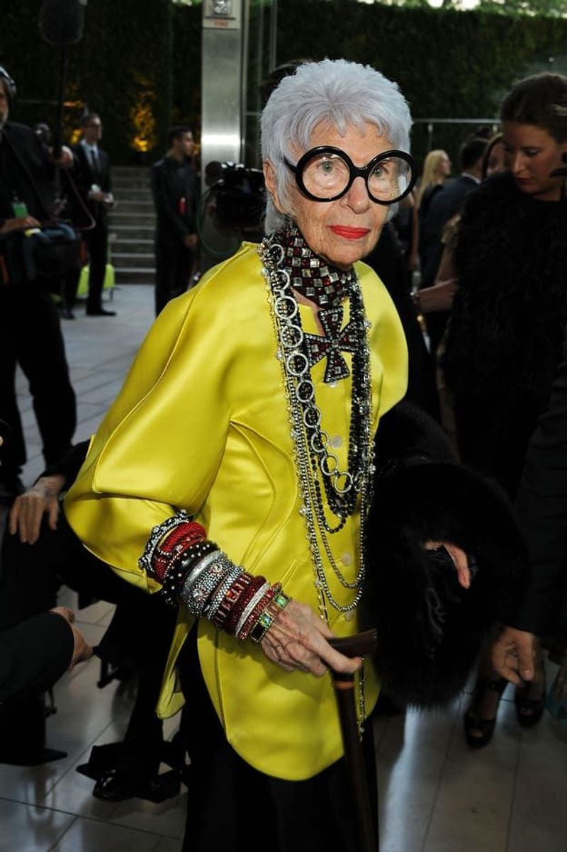
6. Metallic Gold: When Shine Goes Wrong
Full-on metallic gold can transform elegant mature women into walking disco balls. This reflective finish amplifies every texture, drawing unwanted attention to skin concerns.
The harsh sheen creates an outdated 80s vibe rather than timeless sophistication. Gold should whisper, not shout—especially when you’ve earned the confidence to let your natural presence speak for itself.
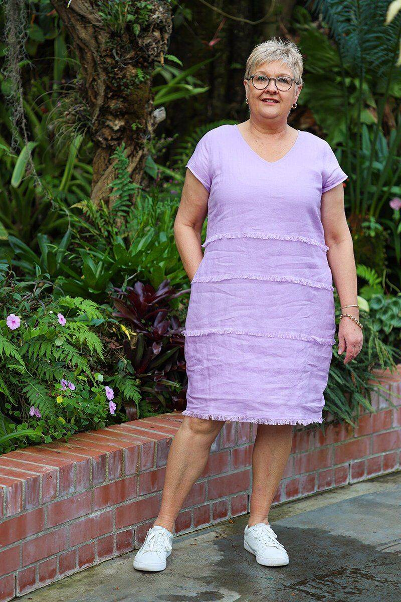
7. Rainbow Pastels: The Easter Egg Problem
Sugary pastel rainbows might work for spring decorations but rarely flatter mature complexions. These childlike color combinations can make sophisticated women appear as though they’re trying to channel their inner five-year-old.
The juvenile associations undermine the gravitas and elegance that come with age. Your wardrobe should reflect the fascinating person you’ve become, not revert to playground aesthetics.
8. Fluorescent Yellow: The Visibility Vest Vibe
Unless you’re directing traffic, fluorescent yellow has no place in a mature woman’s wardrobe. This safety-cone color washes out most complexions and creates a harsh, unflattering glow around the face.
The industrial associations lack the refinement that complements earned wisdom. Your clothing choices should enhance your natural beauty, not overpower it with unnecessary brightness.
9. Pure White: The Harsh Highlighter
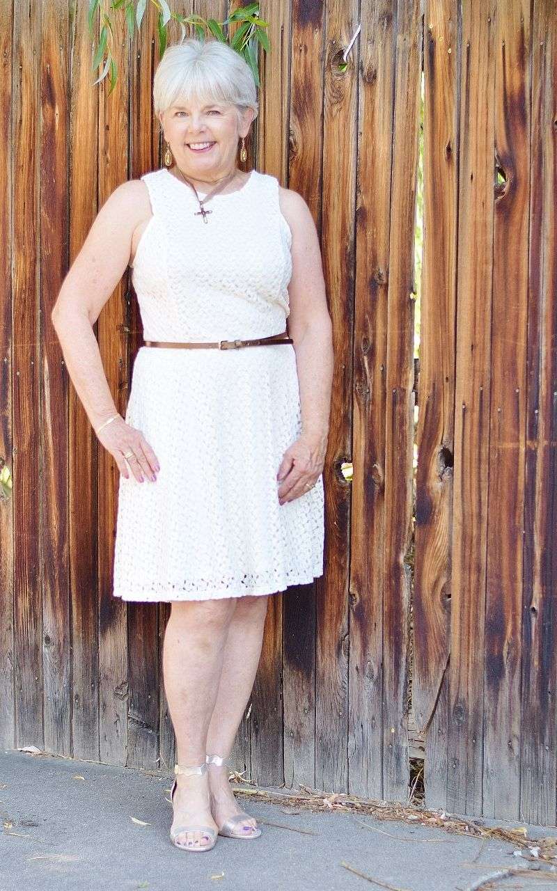
Stark, optical white can be surprisingly unflattering on mature skin, highlighting every line and creating a harsh contrast. This unforgiving shade often drains color from the face rather than enhancing natural beauty.
The clinical brightness can appear aging rather than fresh. Most mature women find that softer off-whites provide the clean look they desire without the unflattering starkness.
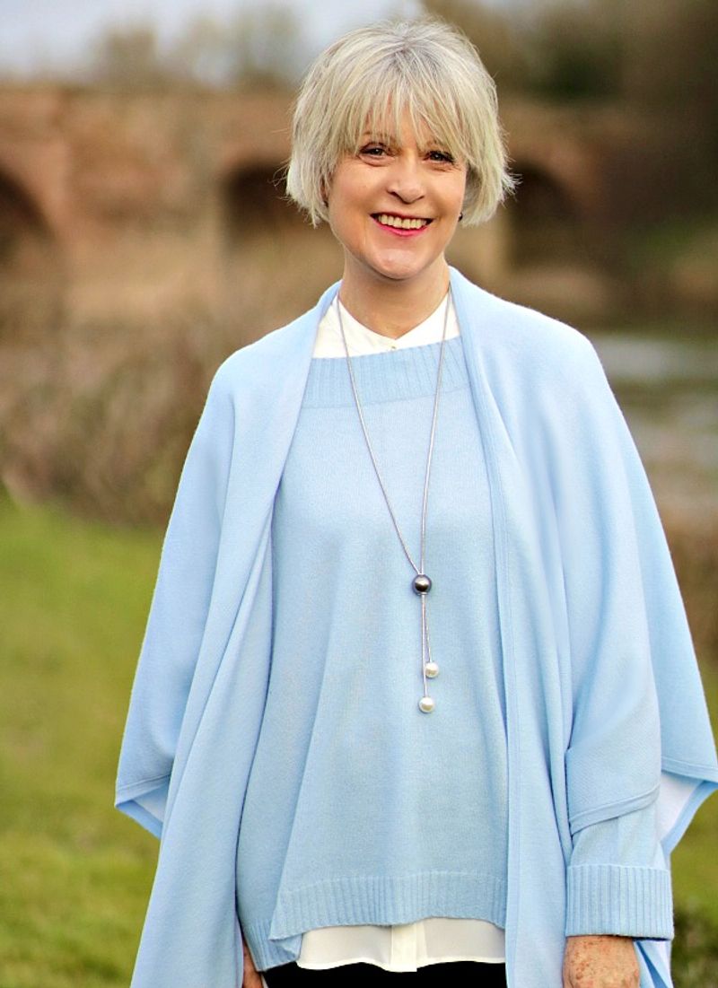
10. Navy Blue: The Timeless Confidence Booster
Navy offers depth and sophistication without the harshness of black. This universally flattering color brings out the best in mature complexions, creating a backdrop that allows your natural beauty to shine.
The quiet confidence of navy speaks volumes about your self-assurance. It’s the color equivalent of a firm handshake—poised, professional, and perpetually appropriate.
11. Burgundy: The Rich Statement Maker
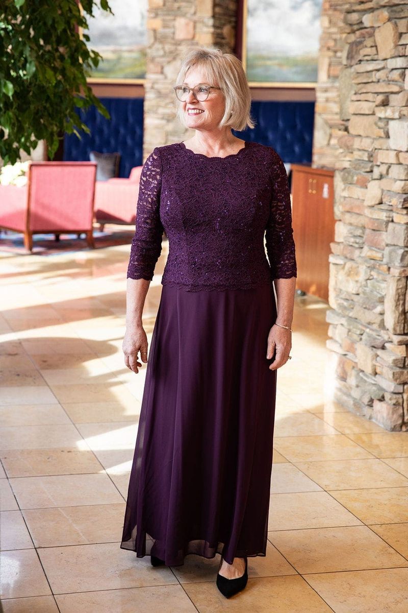
Burgundy brings warmth and richness that flatters mature skin without appearing trying-too-hard. This sophisticated wine tone suggests confidence and self-awareness.
The depth of color communicates substance and style simultaneously. Burgundy has the remarkable ability to make every woman look more polished, regardless of her age or coloring.
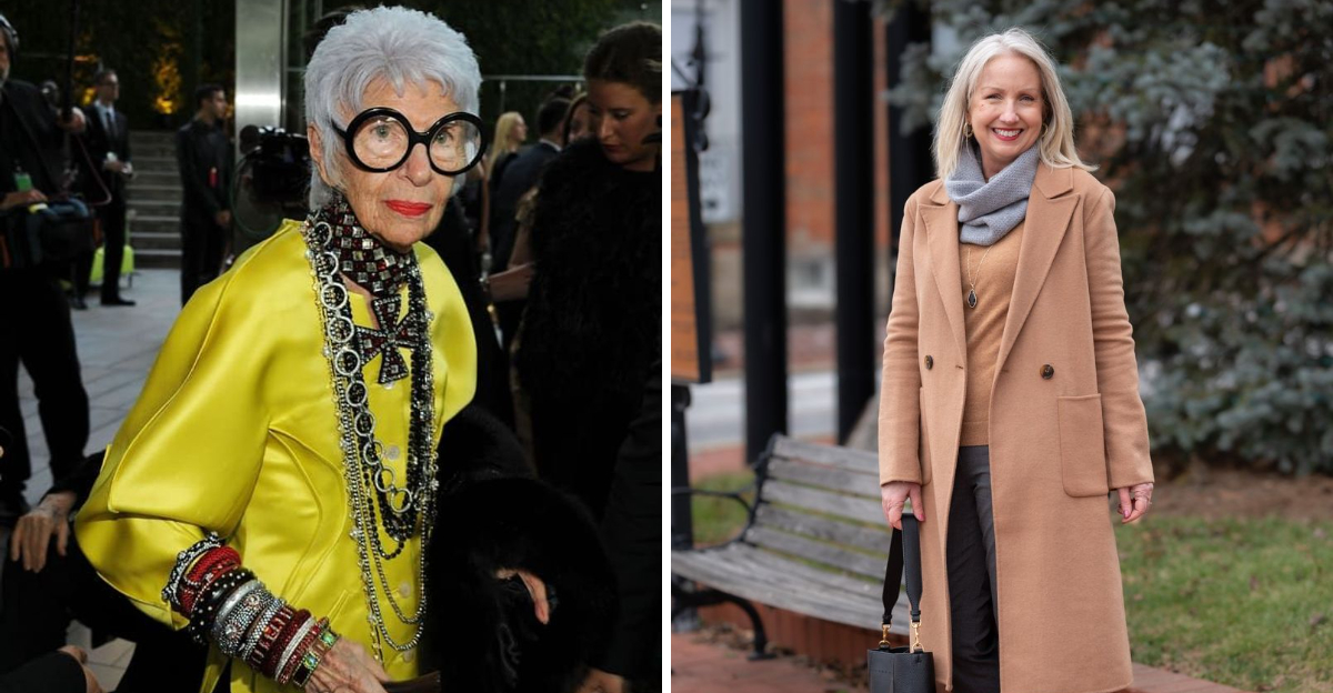
12. Soft Camel: The Luxurious Neutral
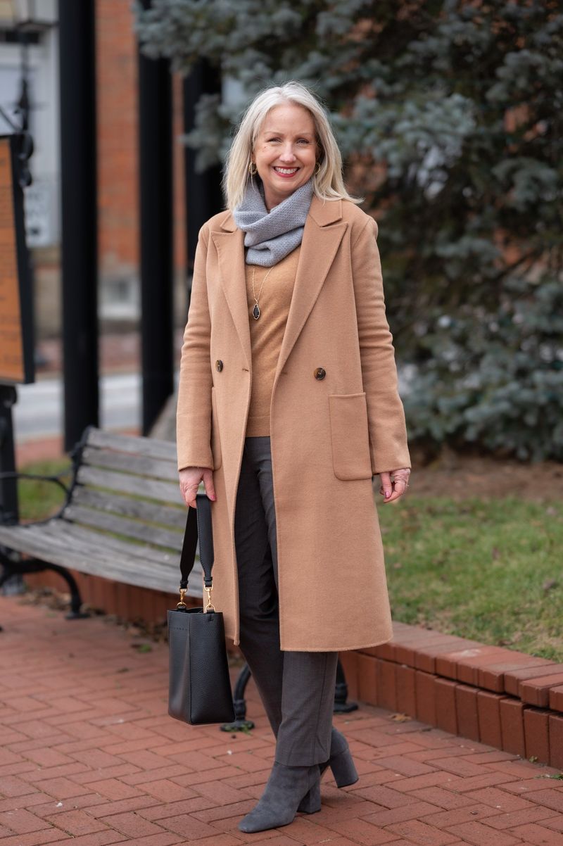
Camel exudes quiet luxury that gets better with age—just like the women who wear it. This warm neutral creates a sophisticated foundation for any wardrobe while softly illuminating mature skin.
The understated elegance speaks of confidence rather than trend-chasing. Camel’s timeless appeal connects perfectly with the self-assured grace that comes from life experience.
13. Soft Coral: The Complexion Enhancer
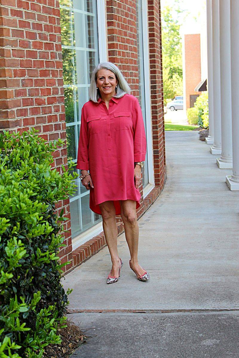
Soft coral brings a flattering warmth to mature skin without the harshness of brighter oranges. This gentle, peachy hue mimics the natural flush of health and vitality.
The subtle rosiness creates a youthful glow without appearing desperate to recapture youth. Coral’s warmth complements the natural changes in skin tone that come with maturity.
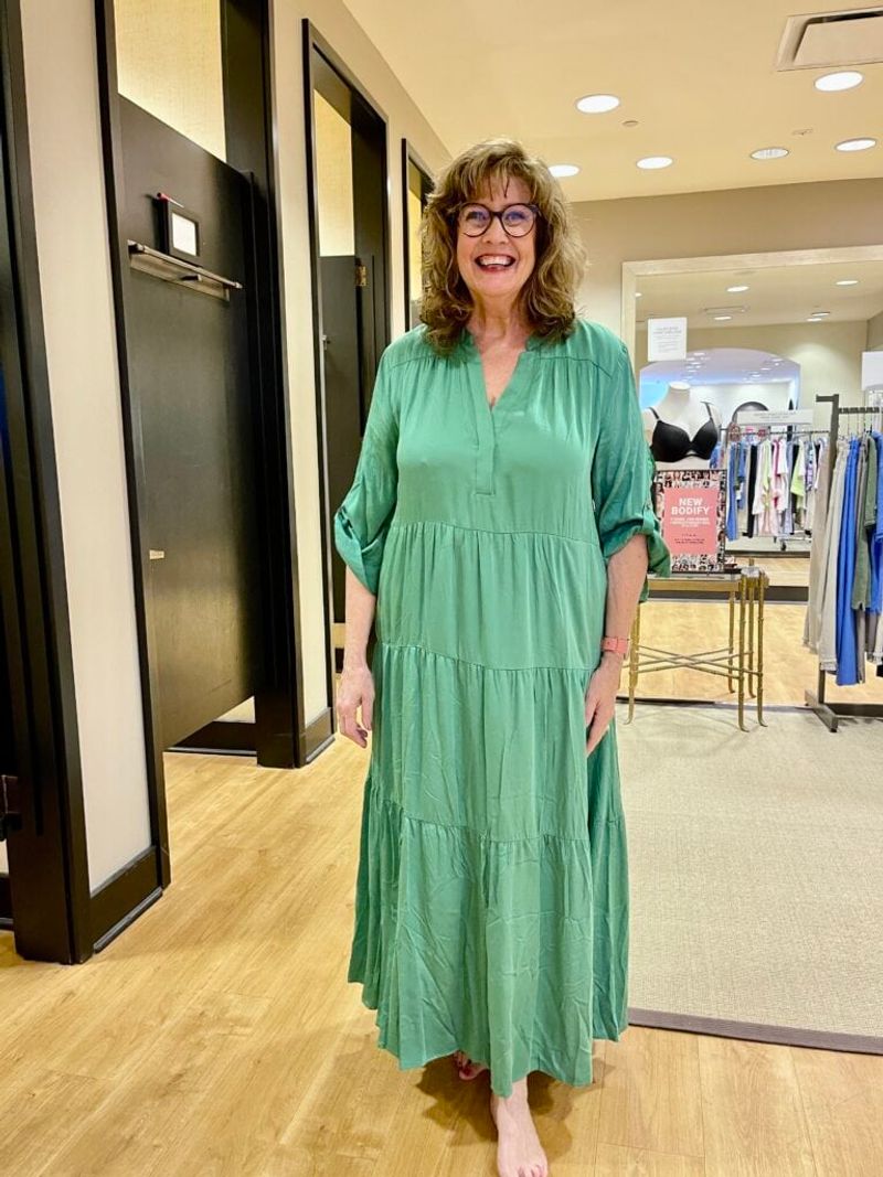
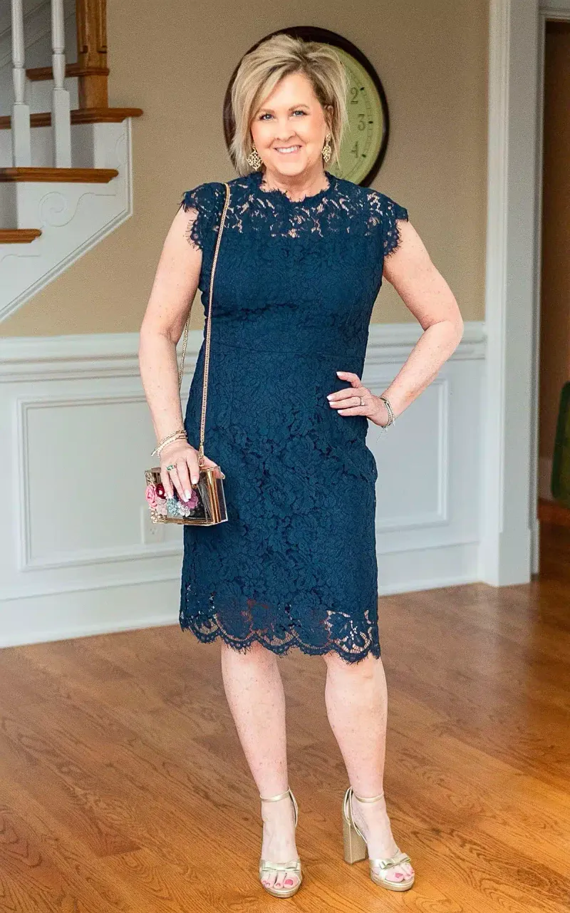
14. Teal: The Confident Color Choice
Teal strikes the perfect balance between statement-making and sophisticated. This rich blue-green hybrid brings vibrance without veering into tacky territory.
The depth and complexity mirror the multifaceted nature of mature women. Teal communicates confidence and creativity while remaining firmly in the realm of elegant color choices.
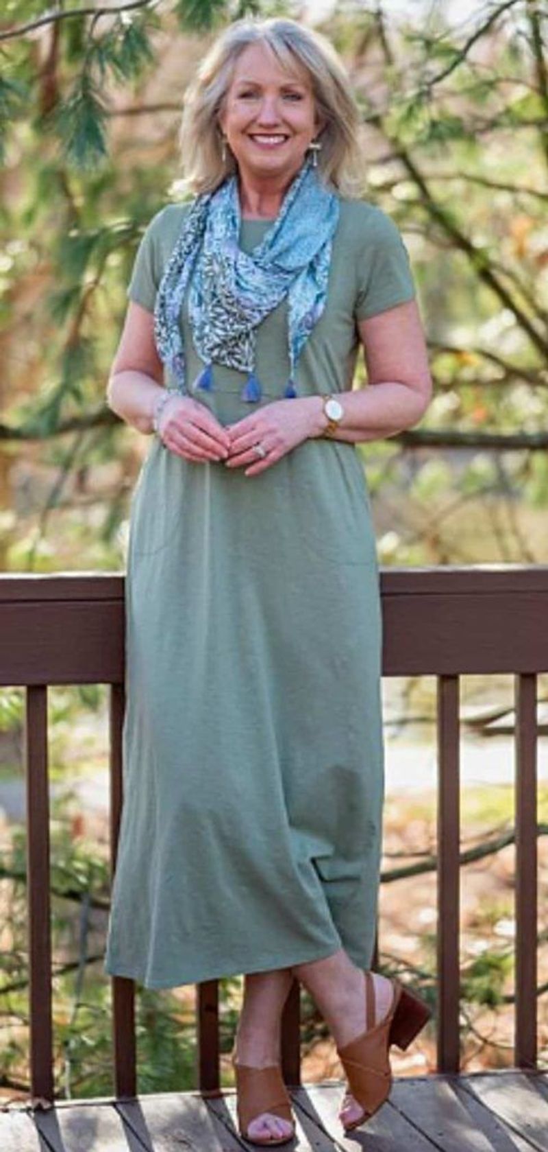
15. Olive Green: The Understated Sophisticate
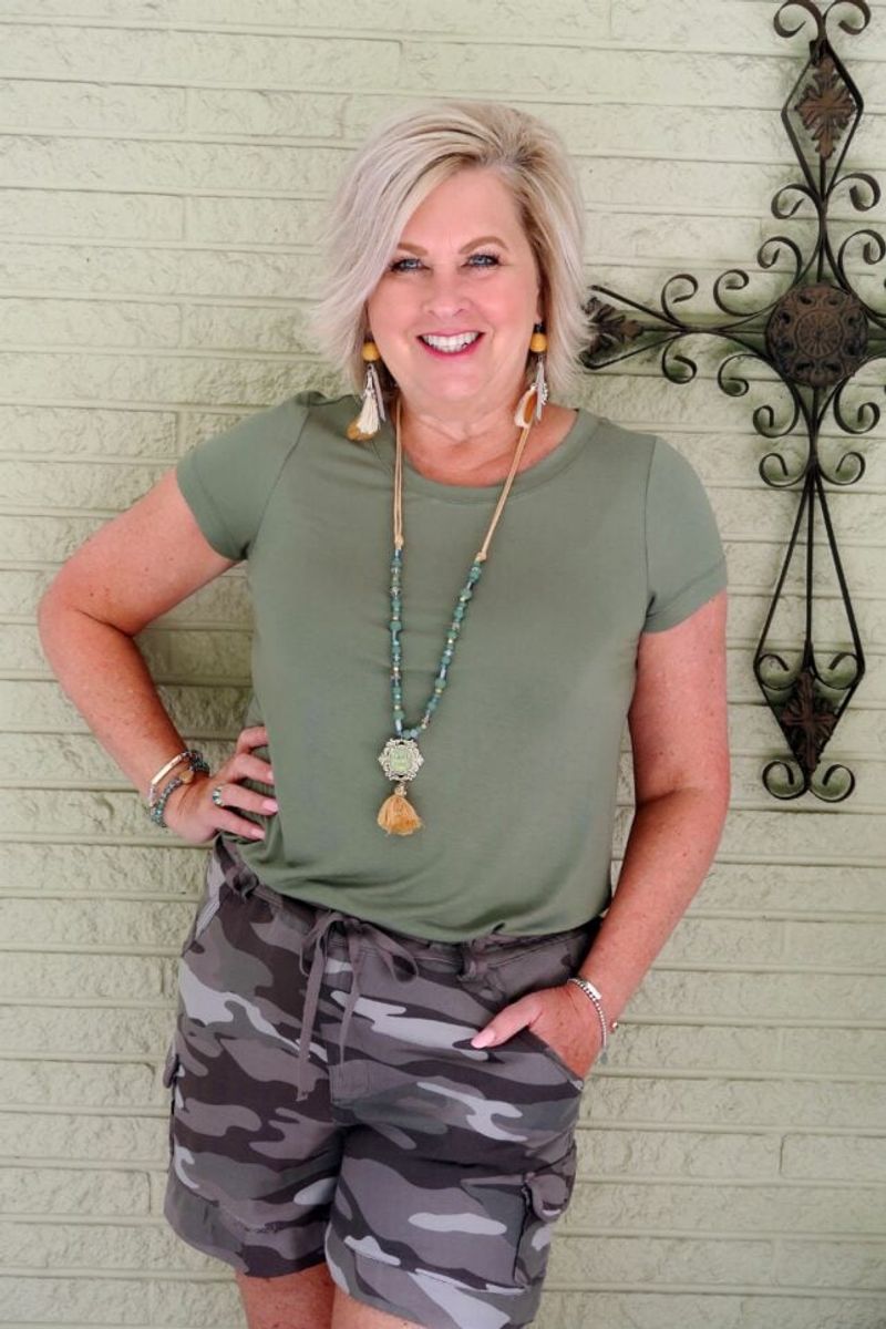
Olive green brings natural sophistication that perfectly complements the confidence of maturity. This earthy tone has depth and character without trying too hard.
The subtle complexity mirrors the nuanced understanding that comes with life experience. Olive’s understated elegance allows your personality to shine while still making a quiet style statement.